Partnering with government to develop South Australia’s first state-wide EV charging network, RAA needed a name and branding solution for this landmark project.
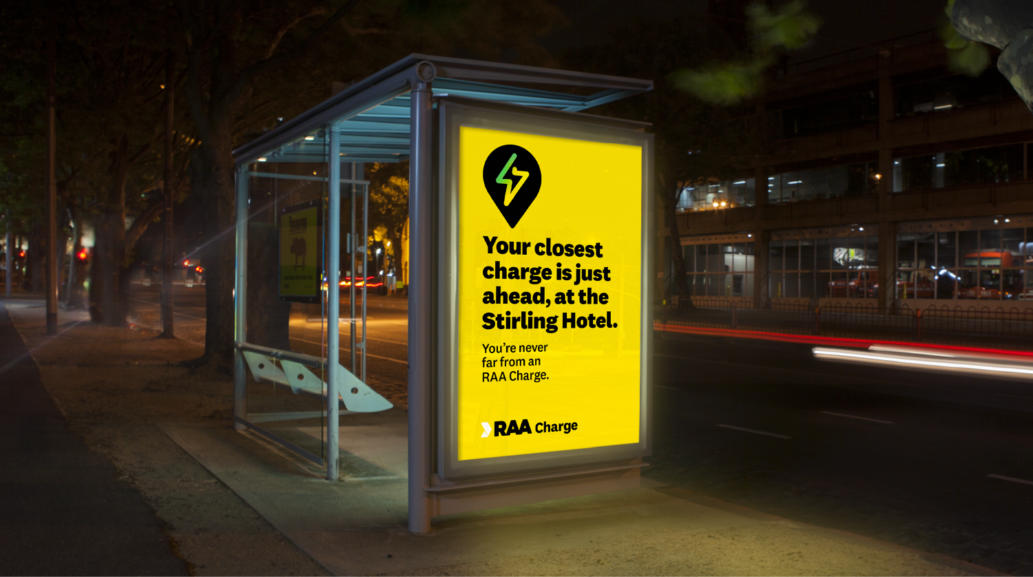
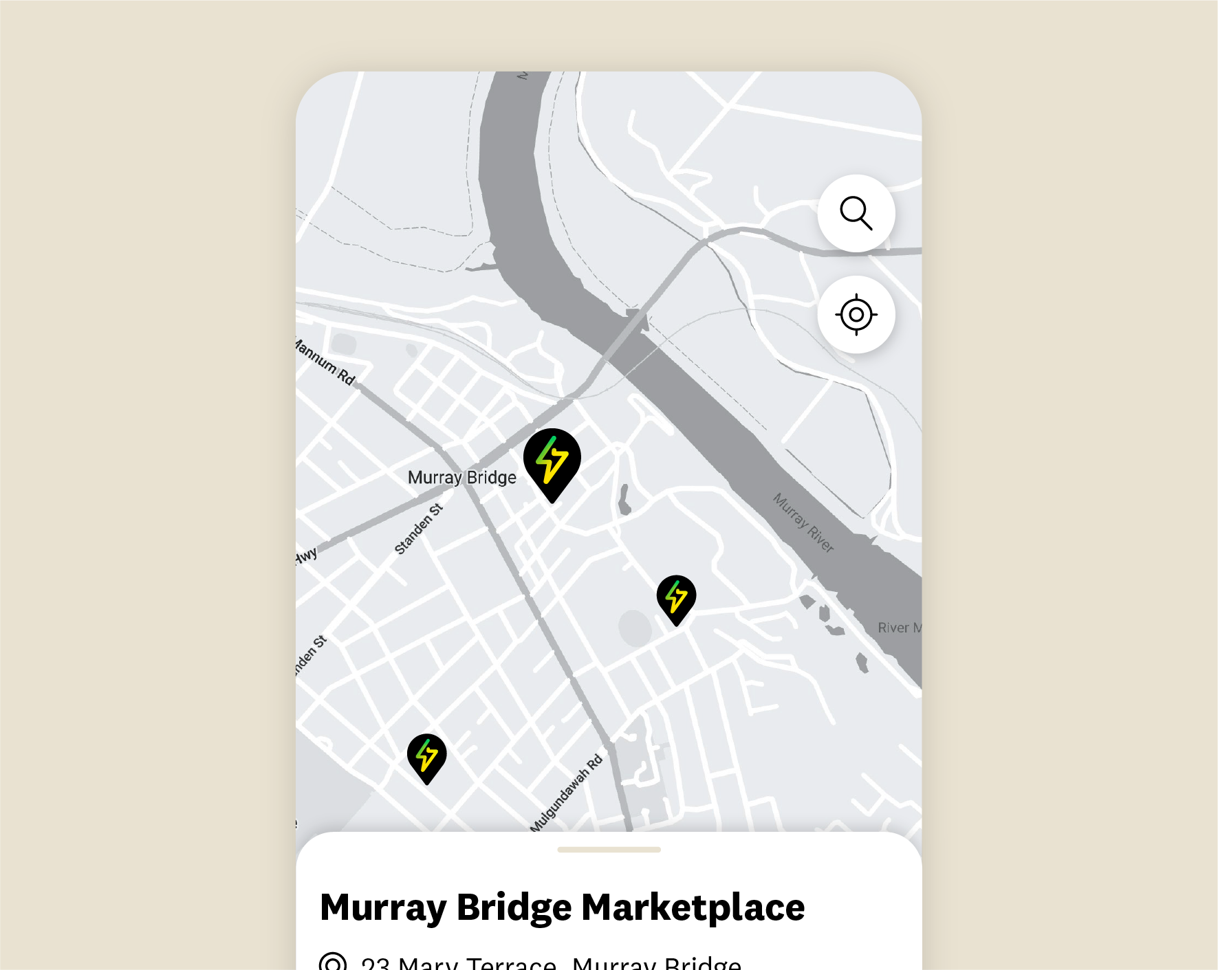
One of the biggest challenges for existing and potential EV owners is ‘range anxiety’ – the fear of not reaching your destination on a single charge. This is more significant for drivers in South Australia than in other states due to the geography and lack of infrastructure.
RAA has been synonymous with motoring in SA for over 100 years, helping drivers reach their destinations through roadside assistance. As such, they are uniquely positioned to influence electric vehicle adoption in SA, solving the modern era of range anxiety.
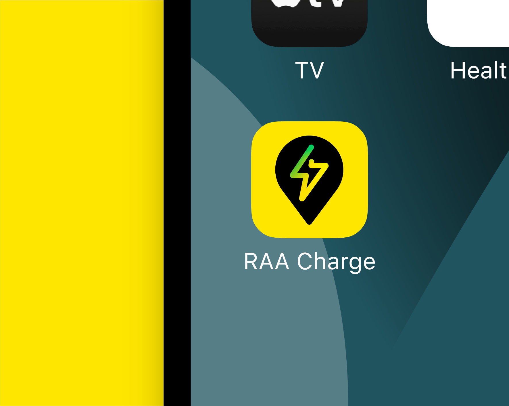
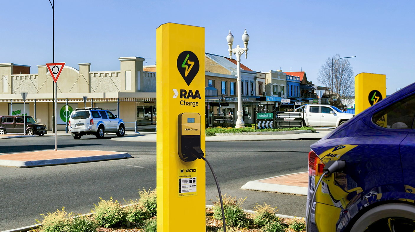
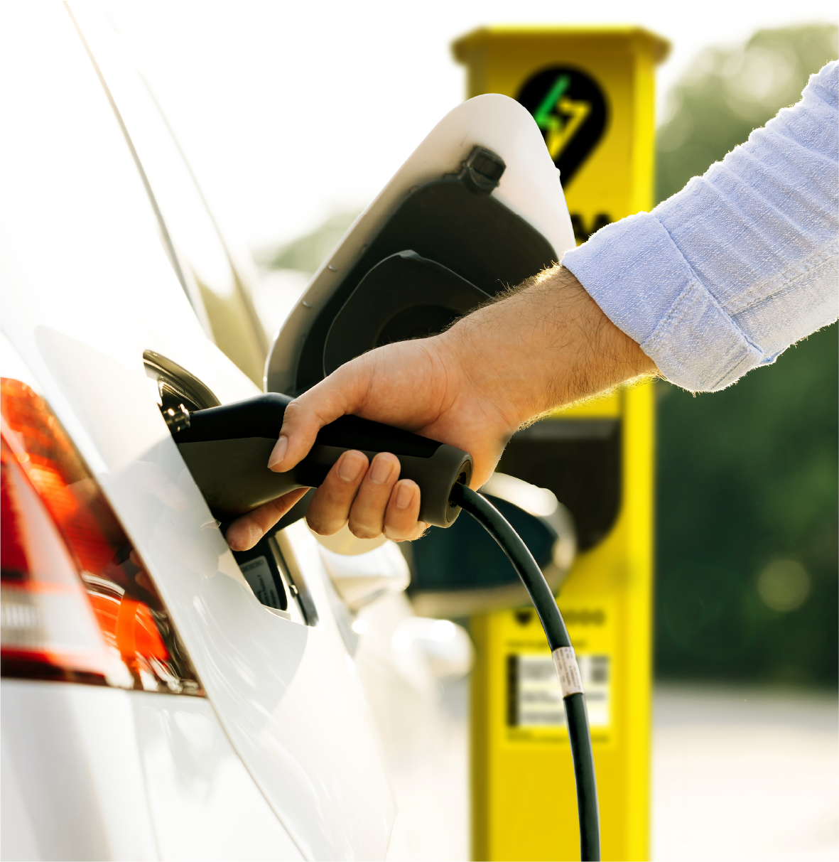
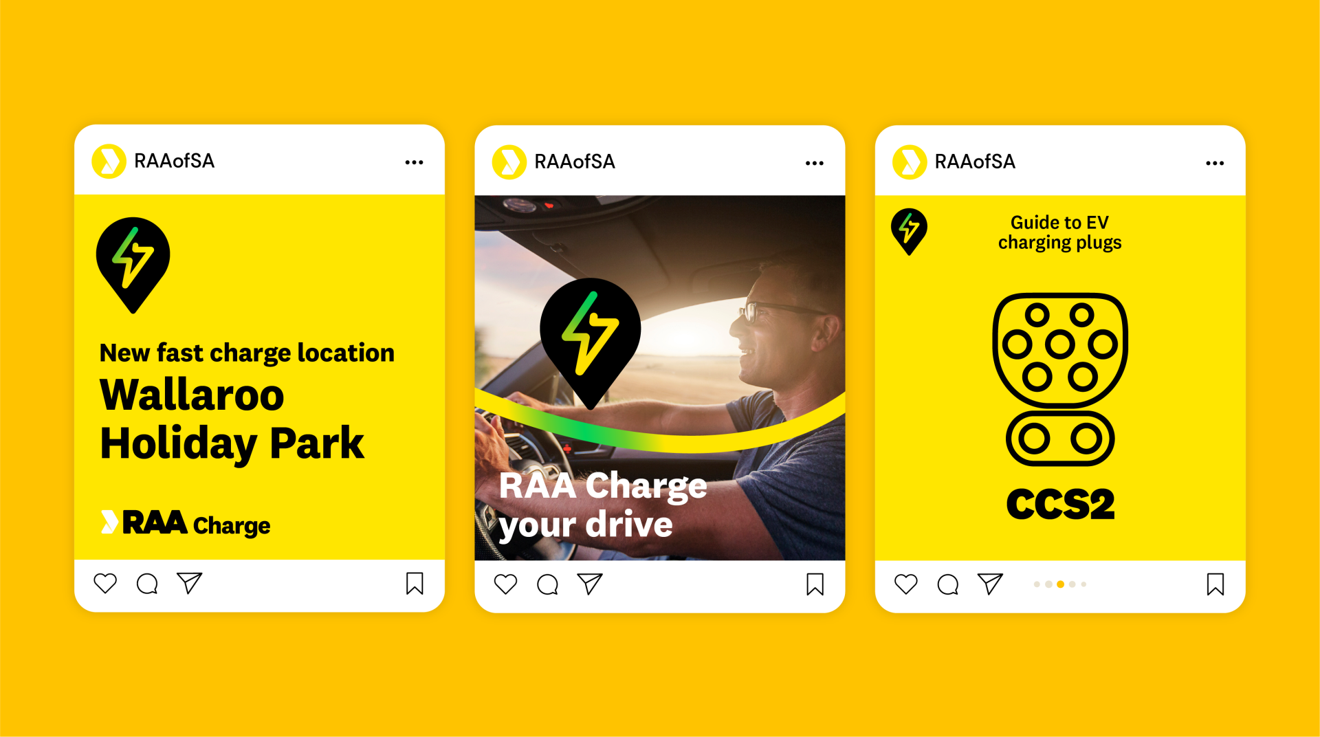
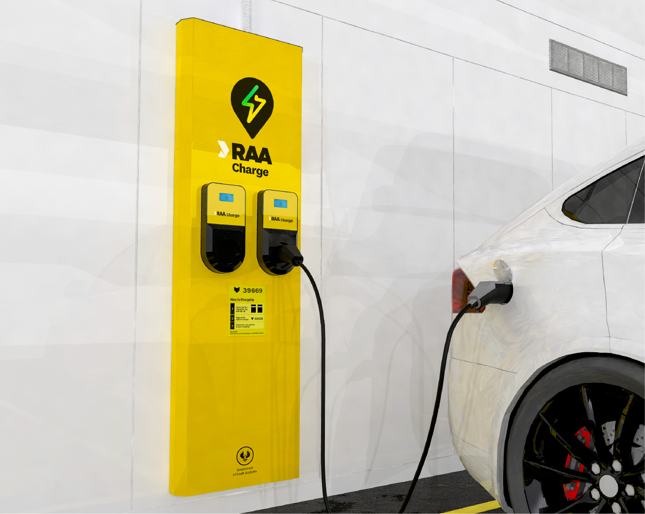
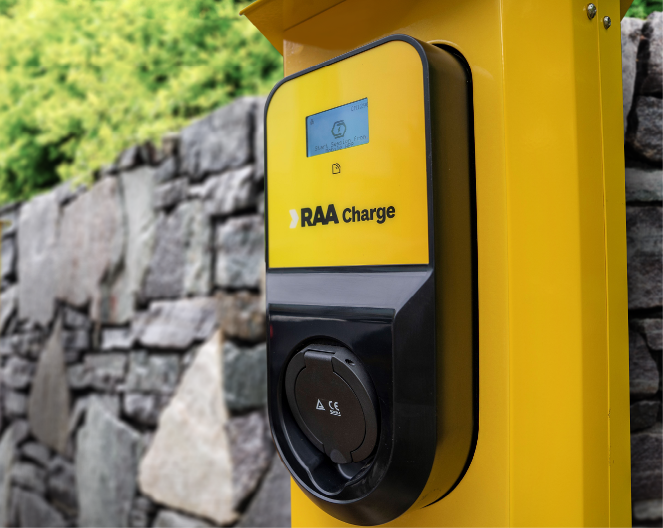
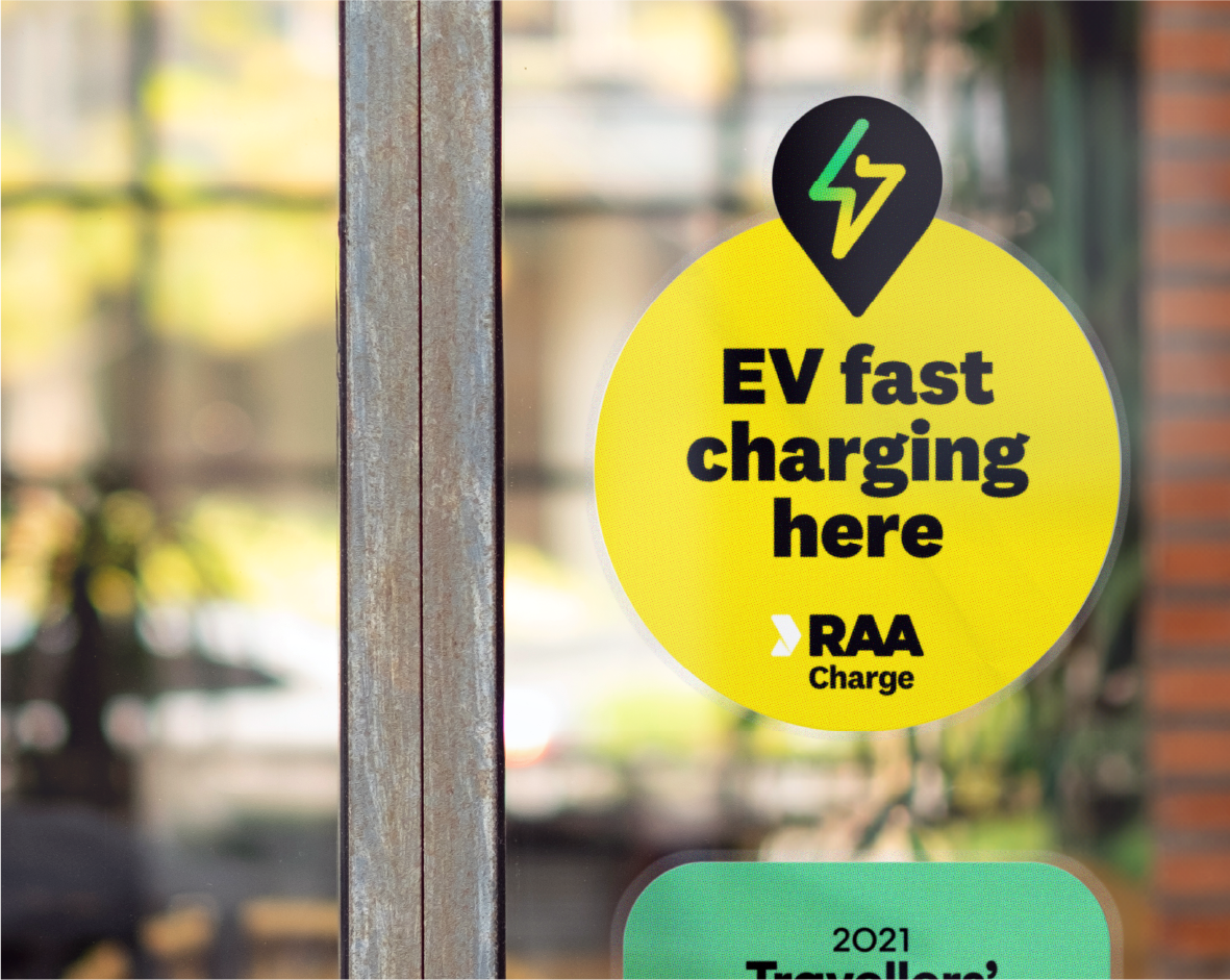
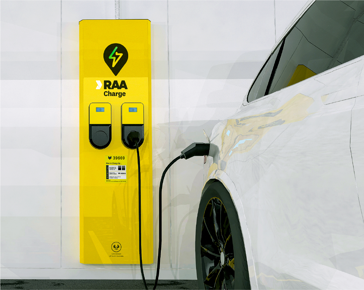
‘RAA Charge’ leverages the trust and confidence in the RAA brand and clearly communicates the purpose of the network. The new symbol, which combines an electrical bolt with a location pin, is readily associated with EV charging but is distinctively RAA in design. The new symbol is designed to be universally understood and highly visible from a distance, assuring existing and future EV owners that they are never far from a charge.
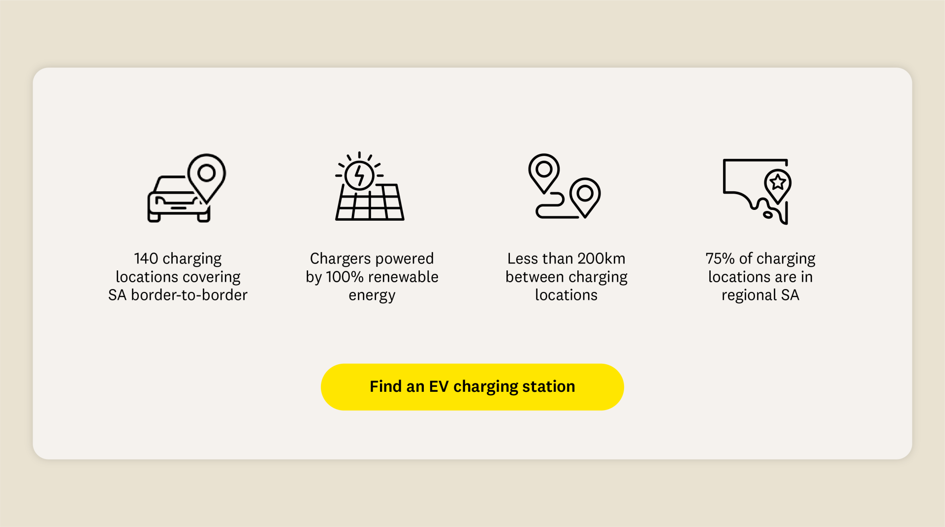
With three-quarters of charging locations in regional areas, we anchored the positioning to the potential of road trips – ‘Freedom for the journey ahead’. Adding green to RAA’s moving line as a feature graphic symbolises a network powered by 100% renewable energy.
Due for completion in 2024, RAA Charge will make driving an electric vehicle in South Australia easier than ever. Establishing South Australia at the forefront of the transition to a low-carbon future.