
With a new business strategy in place Catholic Super wanted to evolve their brand identity to be modern, relevant and attractive to the next generation of members.
First steps
Working closely with the Catholic Super team we carried out a brand audit and conducted a series of workshops. Both members and employers told us that they respected the organisations financial performance and advice while appreciating the personal experiences and shared values.
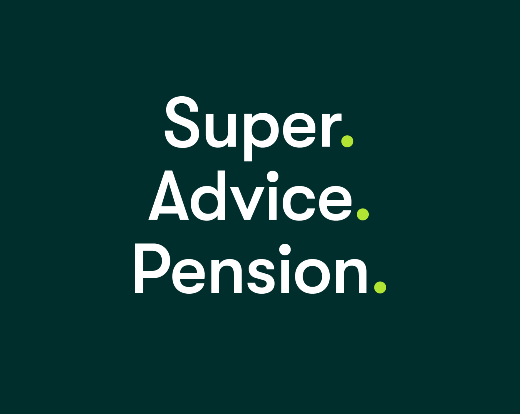
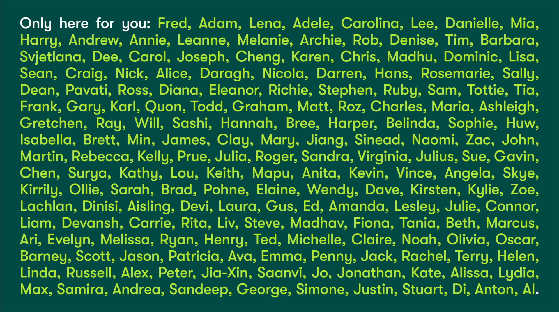
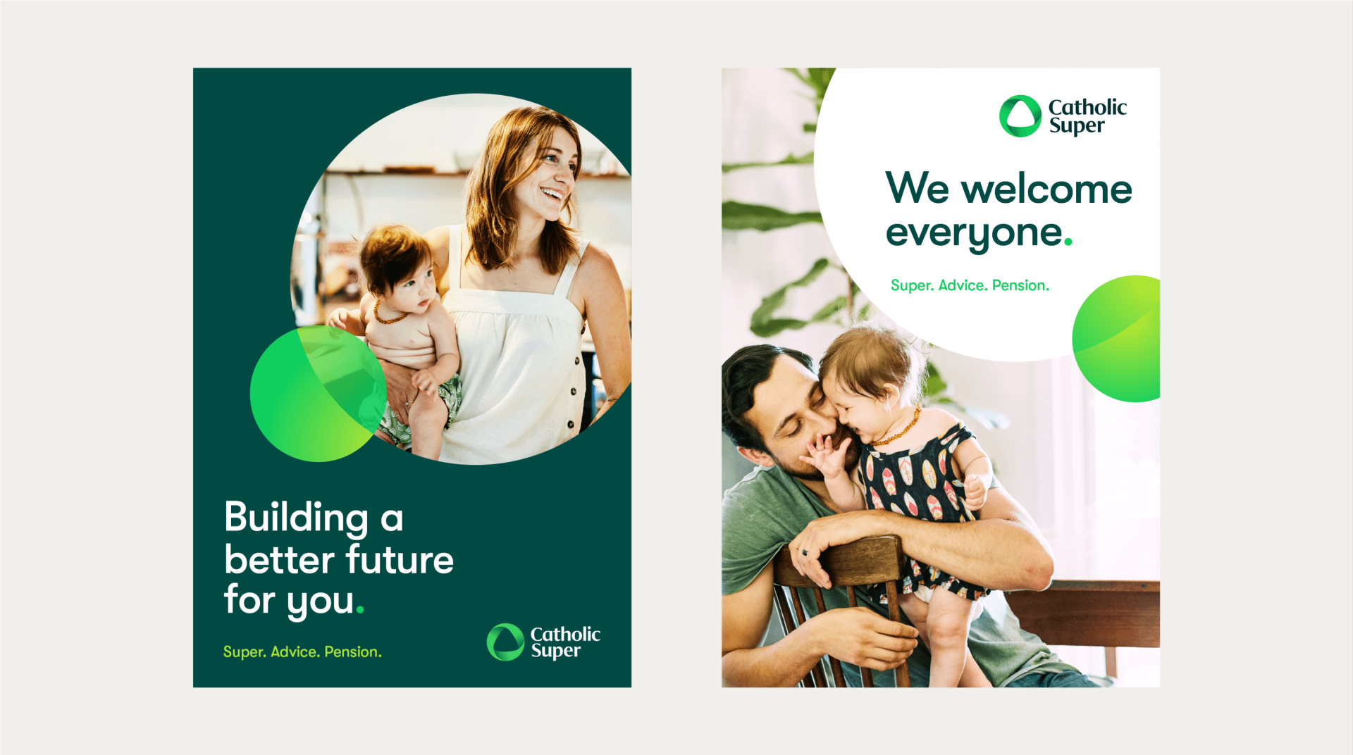
These insights were developed into a simple ownable strategy – ‘Only here for you’ – which builds upon the most compelling aspects of Catholic spirit and puts members at the heart of the organisation. The service offer was simplified to ‘Catholic Super. Super. Advice. Pension.’


Identity
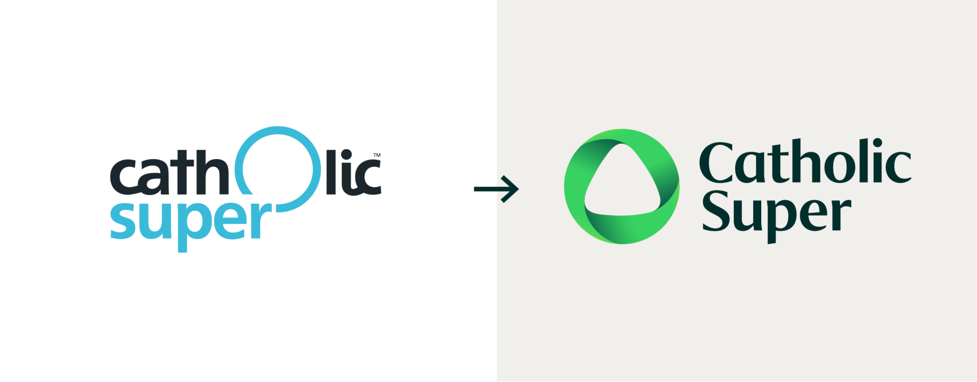
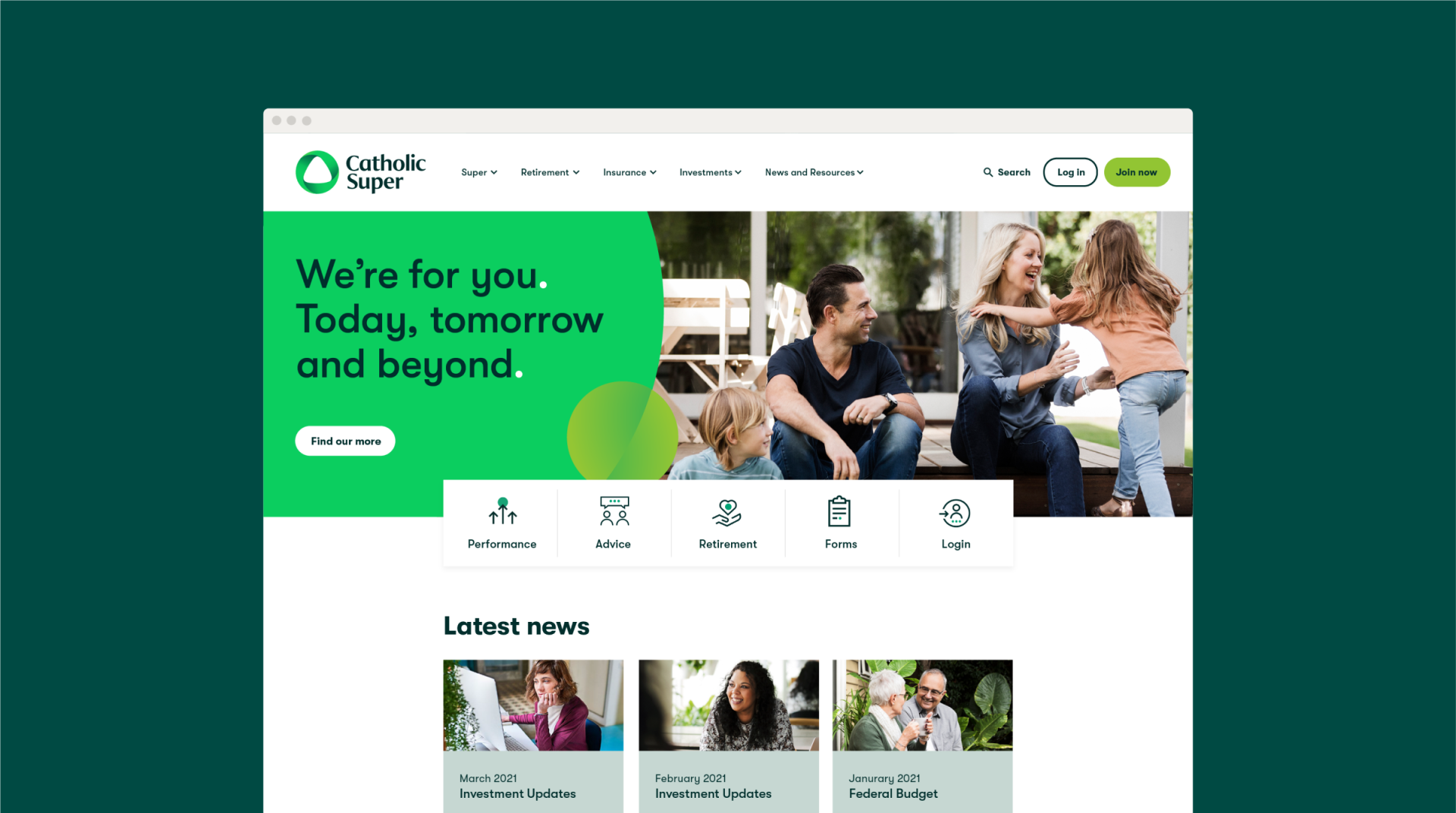
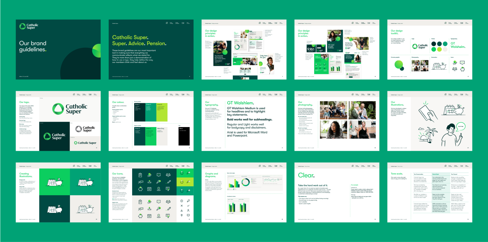
Research driven insights told us that members wanted a visual identity that felt like a ‘familiar financial organisation’. Leveraging the key equity in the logo, the halo, we developed a new symbol bringing together the three functions of the fund – super, advice, pension – uniting them in a dynamic circle. A new wordmark giving a sense of gravitas and financial acumen completes the logo.
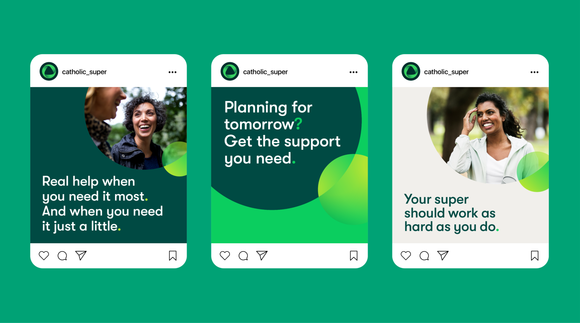
To reposition the brand to be modern and approachable we developed a fresh colour palette, a confident and supportive brand voice and a new typeface.
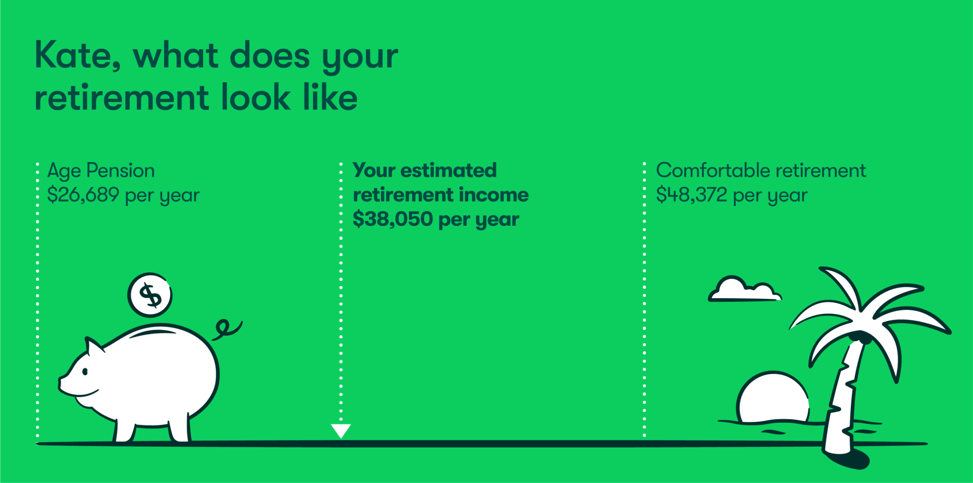
A complete visual identity toolkit was developed including icons, illustrations and a library of images from a photographic shoot.
Design system
The visual and verbal identity is bought together through a coherent system with clear design principles. Tone can be adjusted for different audiences from internal comms to member statements and everything in between. Combined, the system, brand tools and brand voice create a distinctive identity, confidently financial but underpinned with values and humanity.

Launch and beyond
A library of key assets, guidelines and templates were created to empower internal teams and enable efficient brand management.
Milo&Co. also created internal and member launch campaigns for the new identity including motion, social and eDM.