From humble beginnings as a food bank, ASRC had grown in size and support, working with over 1500 asylum seekers in its Footscray and Dandenong centres. Their branding no longer represented the organisation they had become.
SETTING THE INTENT
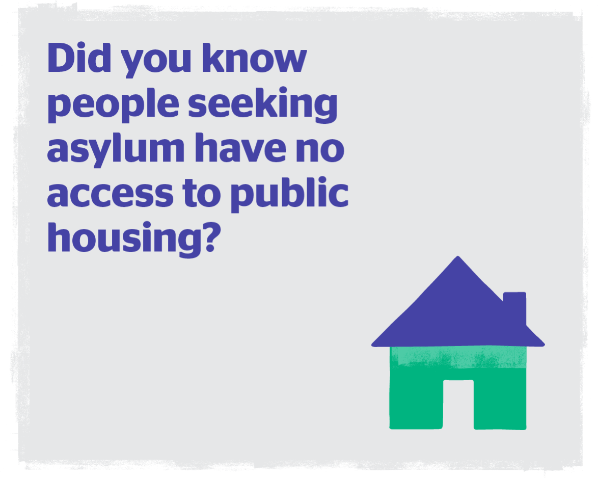
Working alongside Maurice Blackburn we identified that ASRC was now both a movement and a place; a home of hope. This dual purpose, fast growth and limited budgets meant that the existing branding was ad hoc and disparate. Whilst everyone within the organisation was passionate about leading a shift in narrative from ‘asylum seekers’ to the more positive ‘people seeking asylum’, they weren’t presenting as a unified front.
ONE ASRC, MANY VOICES
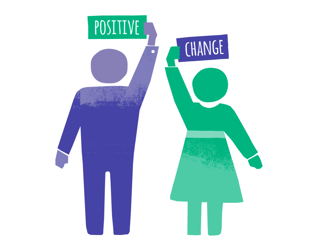
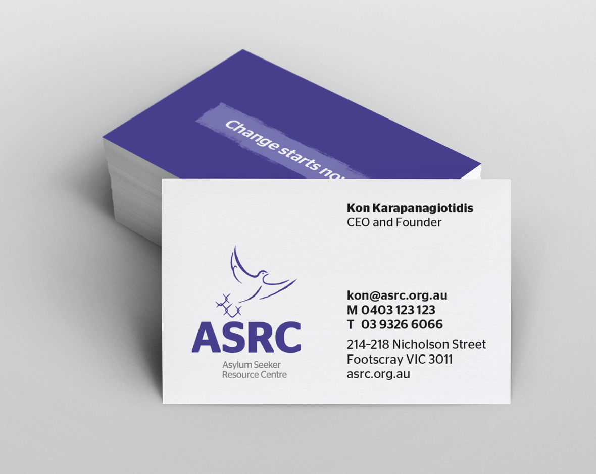
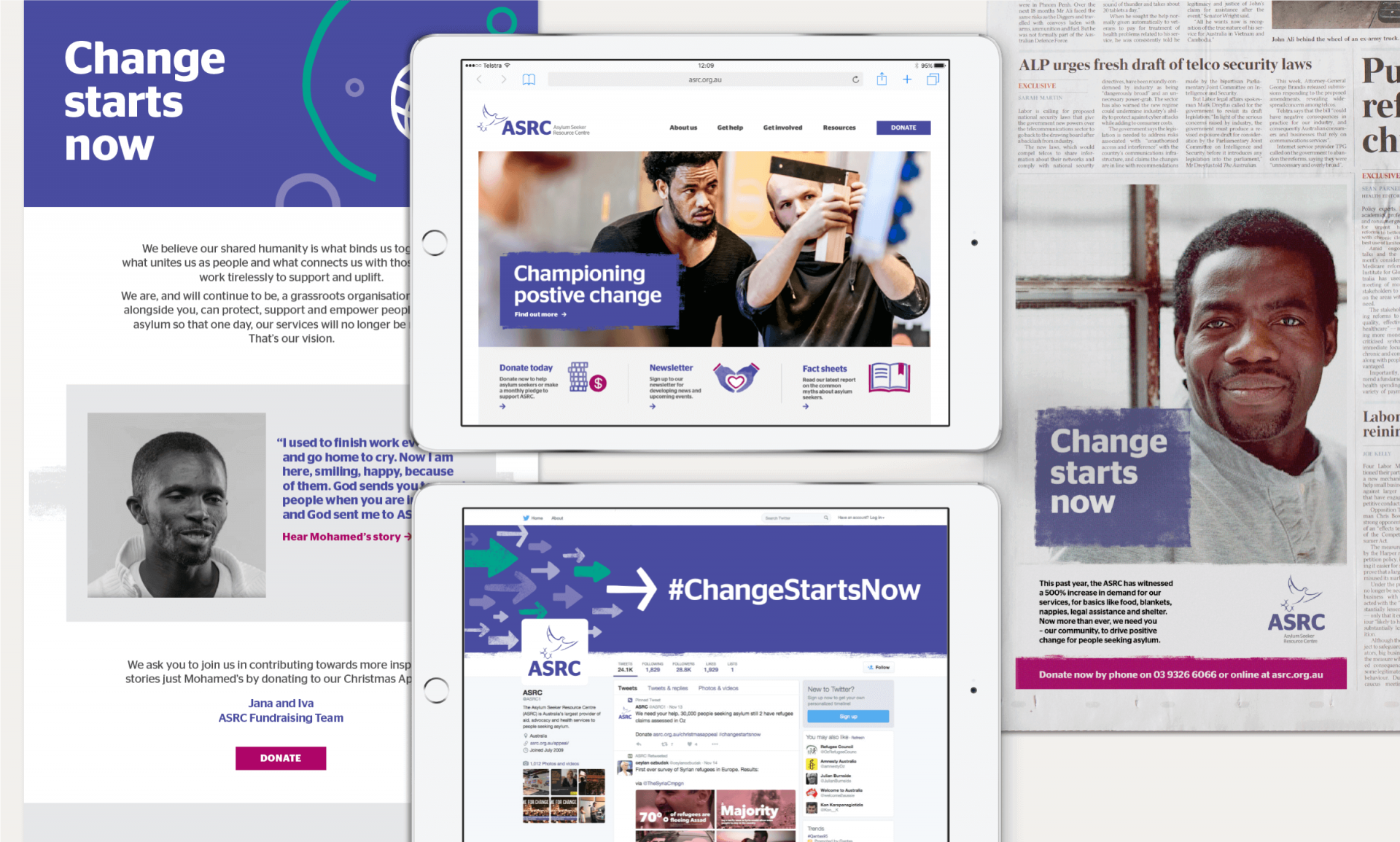
Bringing people and branding together under ‘one ASRC’, we modernised their logo with stronger typography and refined their symbol. We created an identity system that could flex from the shout of a call to action to the reassurance of assistance when needed, and the confidence of social enterprise. All whilst bringing people, and the many cultures they represent to the fore.
BRINGING IT TO LIFE
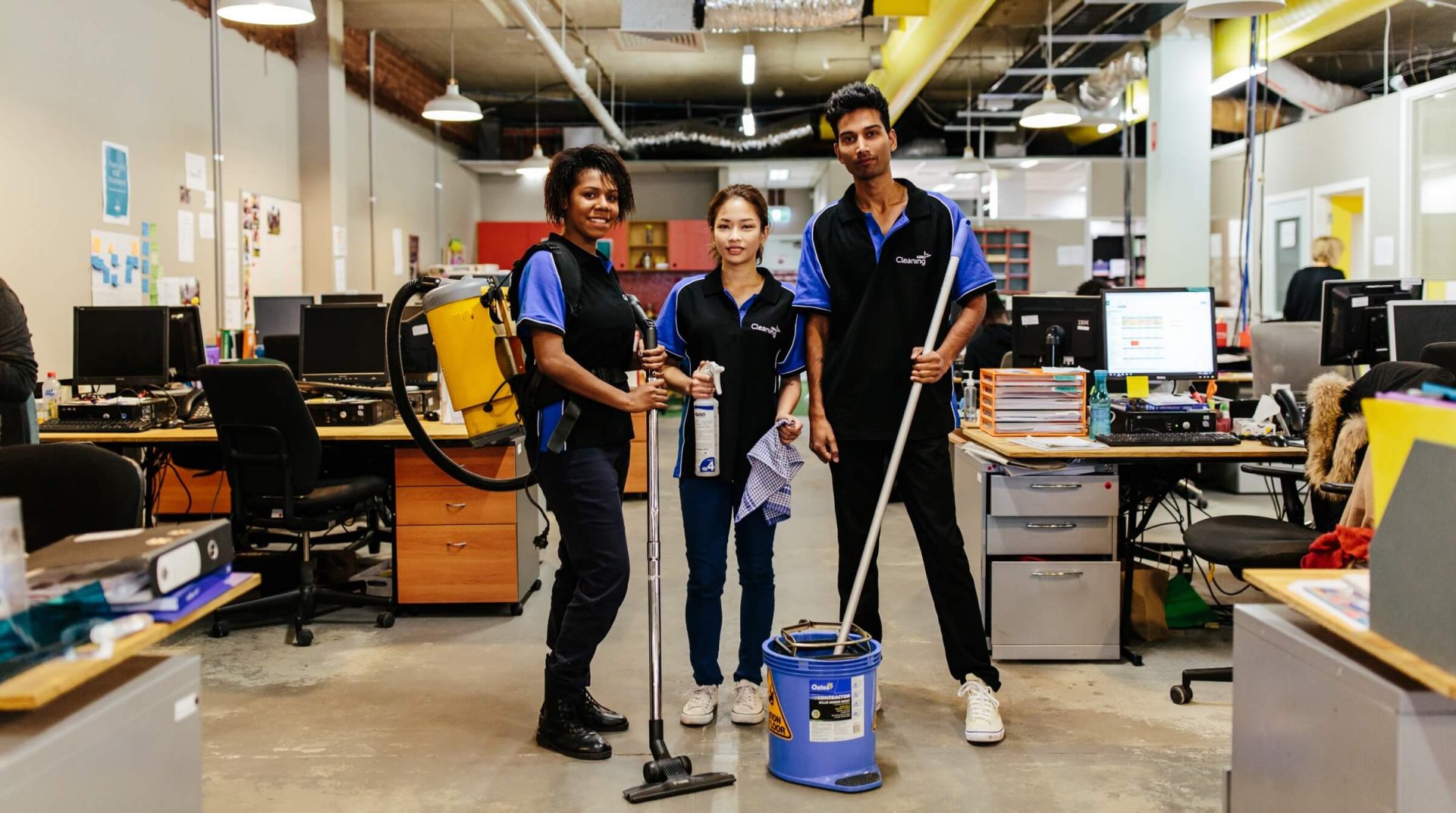
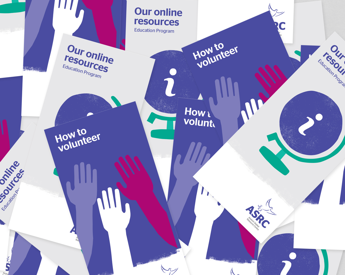
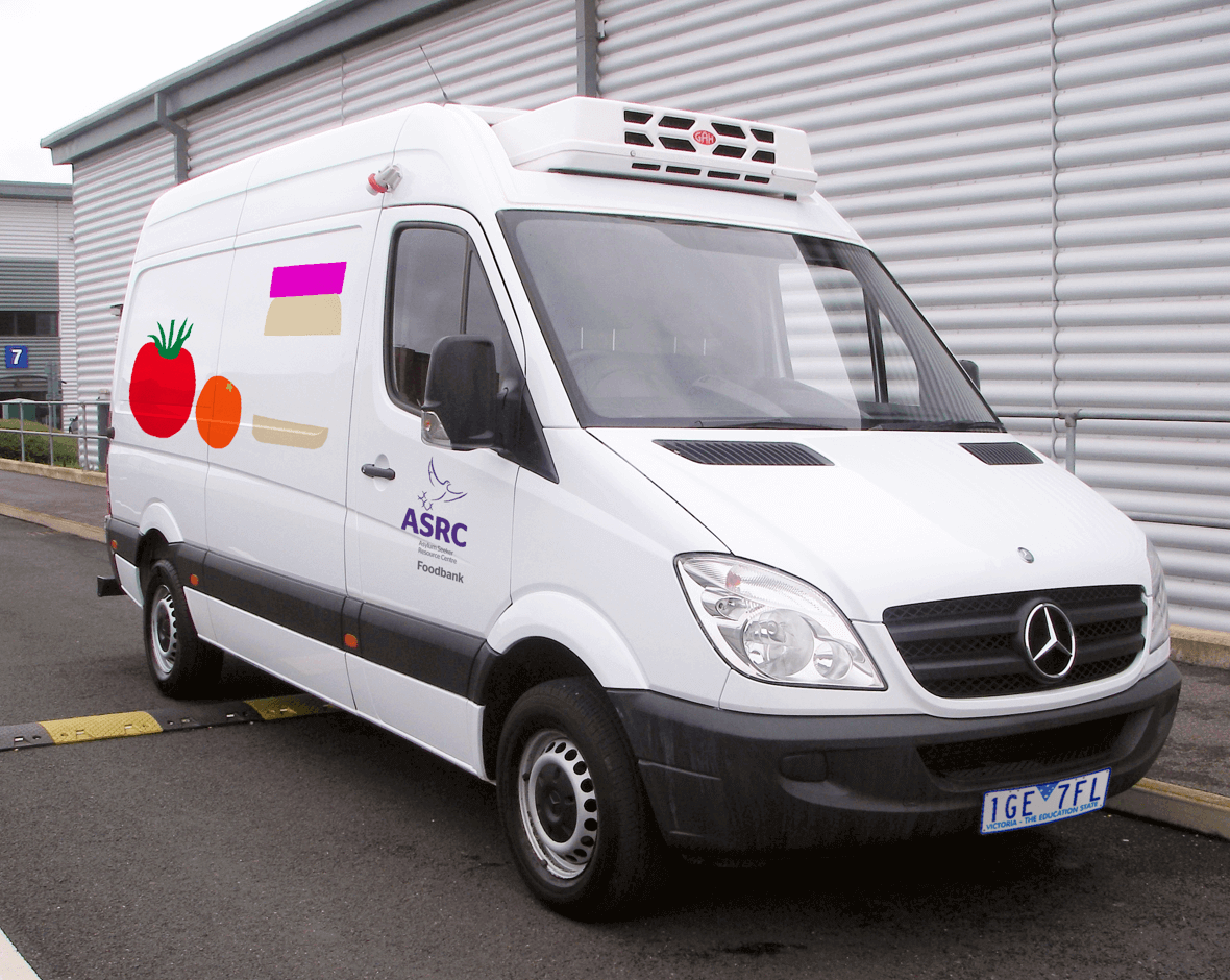
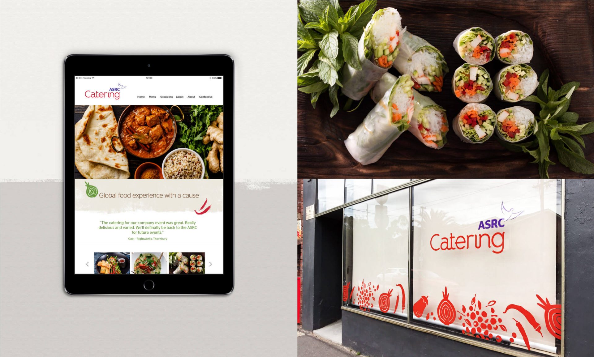
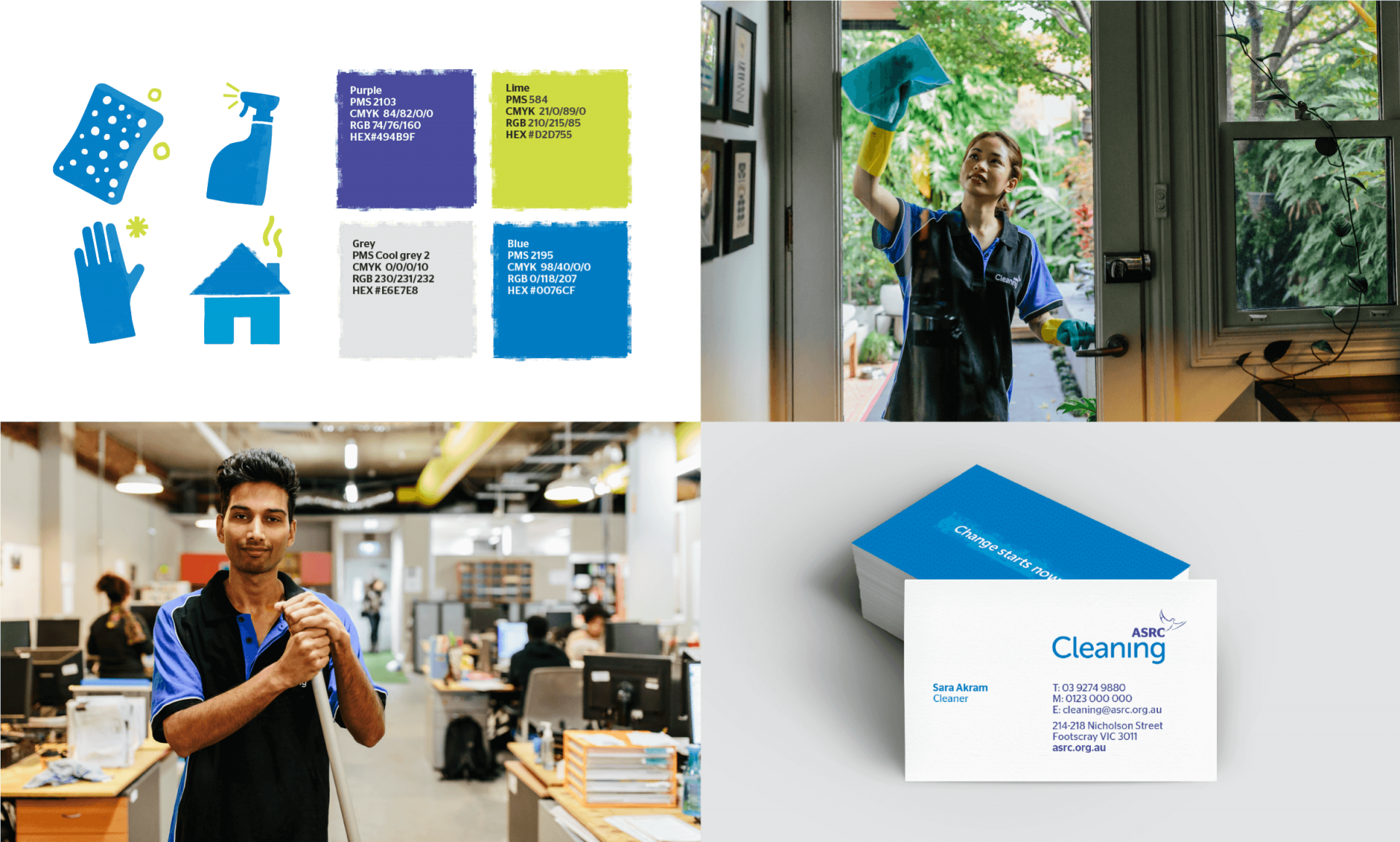
In application, the brand identity is simple, direct and humane. We developed comms, eDM’s and website design as part of the project. Identities were also developed for ASRC Catering and ASRC Cleaning, initiatives which demonstrate the positive contribution asylum seekers can make to our society.
ONGOING SUCCESS
Our work has been wholeheartedly embraced by employees, volunteers and clients. It has helped to bring a more professional face to the organisation, essential in securing funding and helping their voice to be heard. Since launch the organisation has experienced further growth, and whilst this growth conflicts with their vision of ‘a world where ASRC isn’t needed any more’, it does make us reflect on how much our community needs them now.